Varying sized opportunities for the product compare tool that increased engagement YoY.
- Which? Compare
-
- Product Design
- Retention
- 2024
Summary
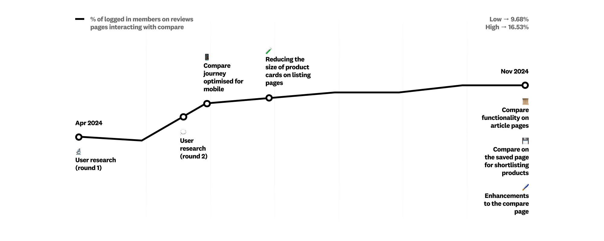
Leaky bucket retention problem → We did some useful things → This increased engagement with the compare tool 38% YoY → Good outcomes for both users and the business
- My role
- Leading design and product
- OKR setting and stakeholder management
- Working closely with user researchers
- Prototyping, user testing, and supporting the analysis
- Writing A/B test plans
- Collaborating with experimentation and data teams
- Ticket writing and being hand-ons with engineering
- Final UAT sign off before shipping
Problem
With a leaky bucket issue within the subscription side of the business, our squad was tasked with how we could better retain members. A fundamental step in the research and buying journey is the ability to compare products at a glance. At the time, we weren't doing a good enough job in this area for members.
As a squad, we identified 'compare' as a big opportunity to focus on where we could improve journeys for users and increase member engagement.
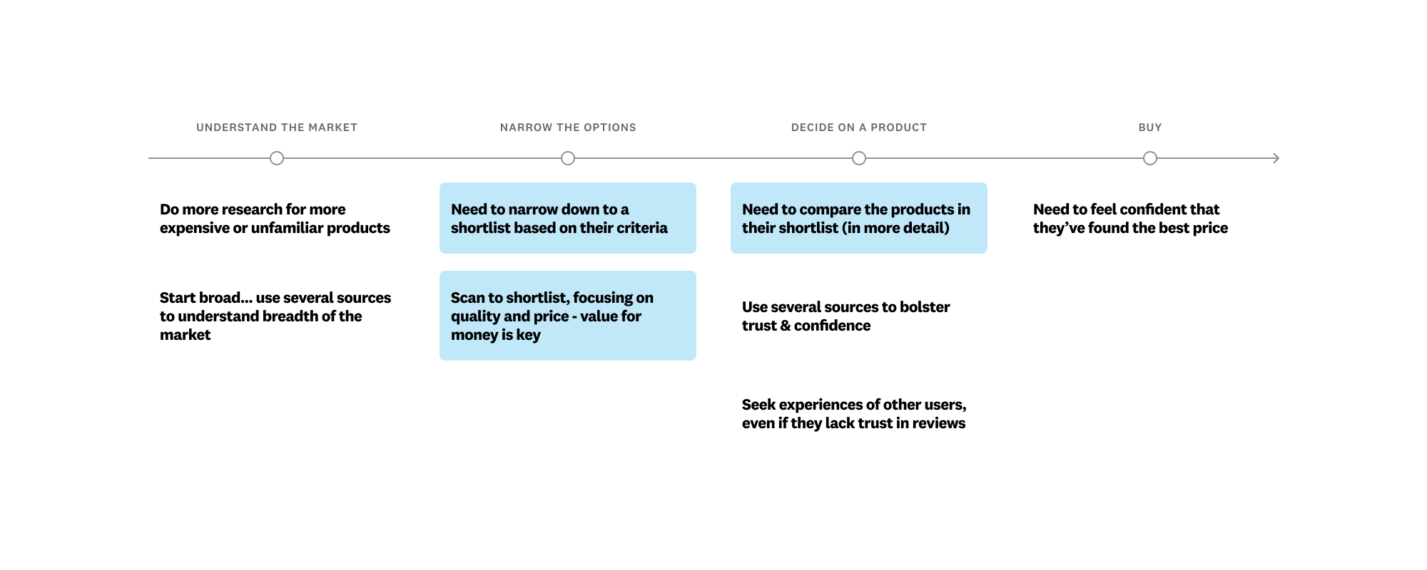
Research
We already knew a lot about of the research and buying journey process through previous research but we didn’t know how our current compare journey was performing for users apart from our own assumptions and frustrations with the experience.
As a squad, we undertook 2 rounds of research to uncover insights and pain points by showing our current experience and new designs in front of participants on UserTesting.
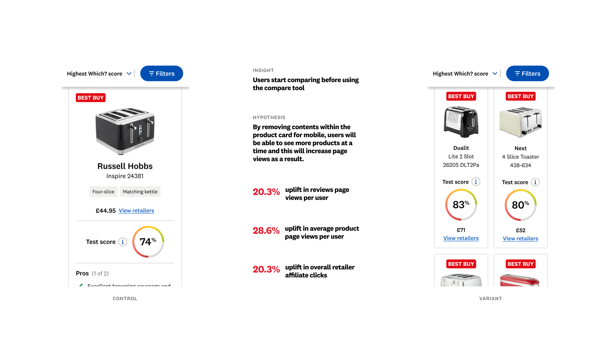
This included a new mobile concept for the compare journey which we decided was a no-brainer to test as an opportunity because for whatever reason, the compare tool was never available to over 50% of our users.
Opportunities
Using the insights from the research, we came together as a squad to come up with ideas on how we could tackle the more pressing areas of concern for users.
We then further validated these ideas through A/B test experiments and where necessary, evaluative research. We were continuously learning through research and experiments using both qualitative and quantitive data points to ensure that any new designs were meeting both user needs and increasing engagement metrics respectively.
Big and small bets
We rolled out a number of initiatives confident that they would impact engagement metrics positively. There's uncertainty of how the changes will perform once everything is shipped. We can hope for an accumulation effect but the data may say otherwise and leave us with more questions than answers.
- Here's a list of the initiatives we shipped:
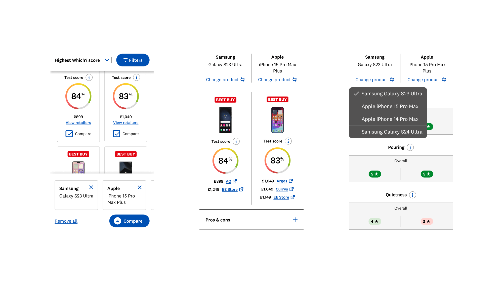
- Compare journey optimised for mobile
- Reducing the size of product cards on listing pages
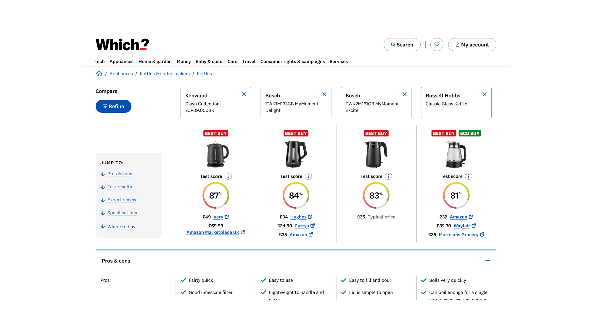
- Compare functionality on article pages
- Enhancements to the compare page
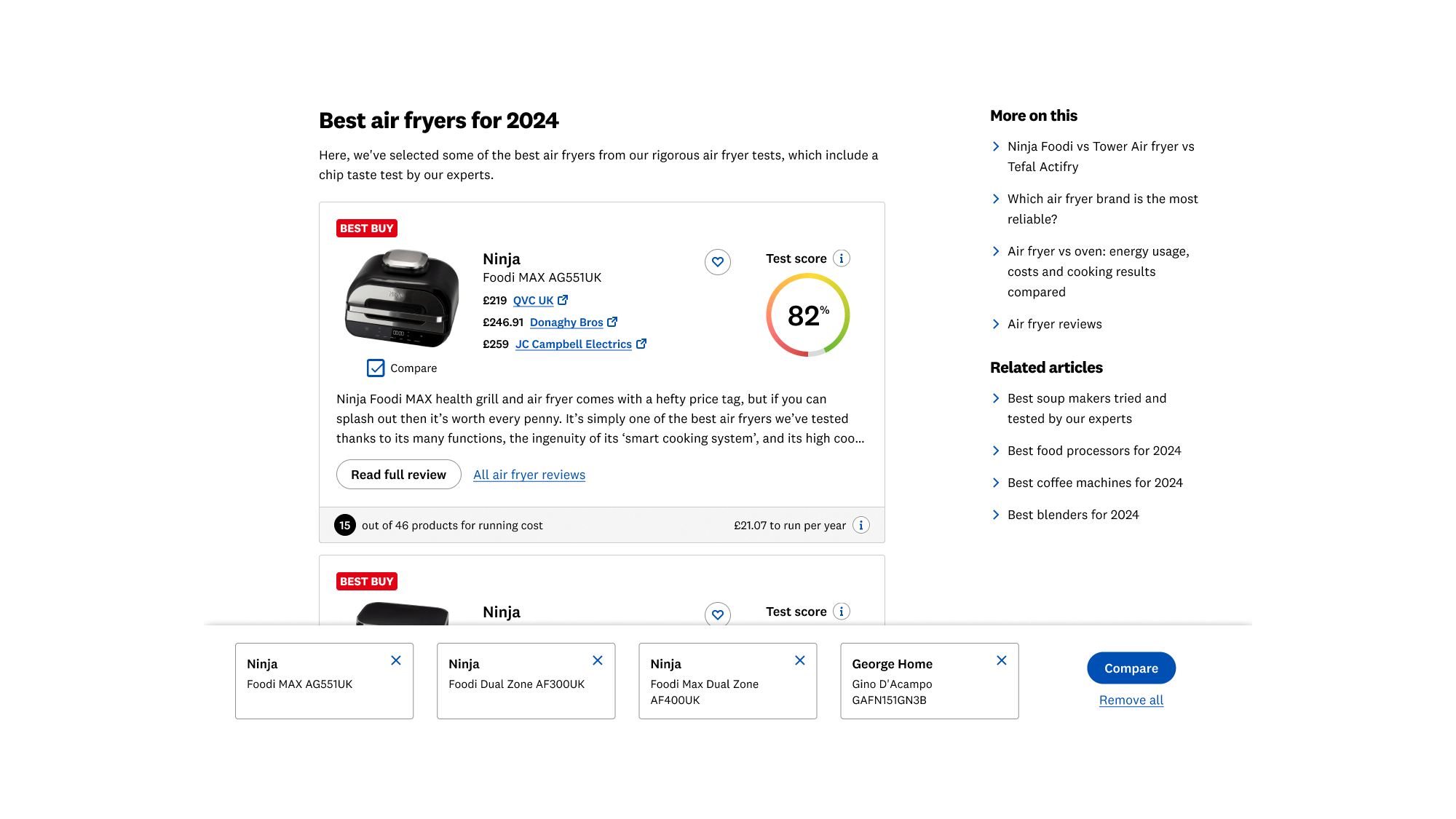
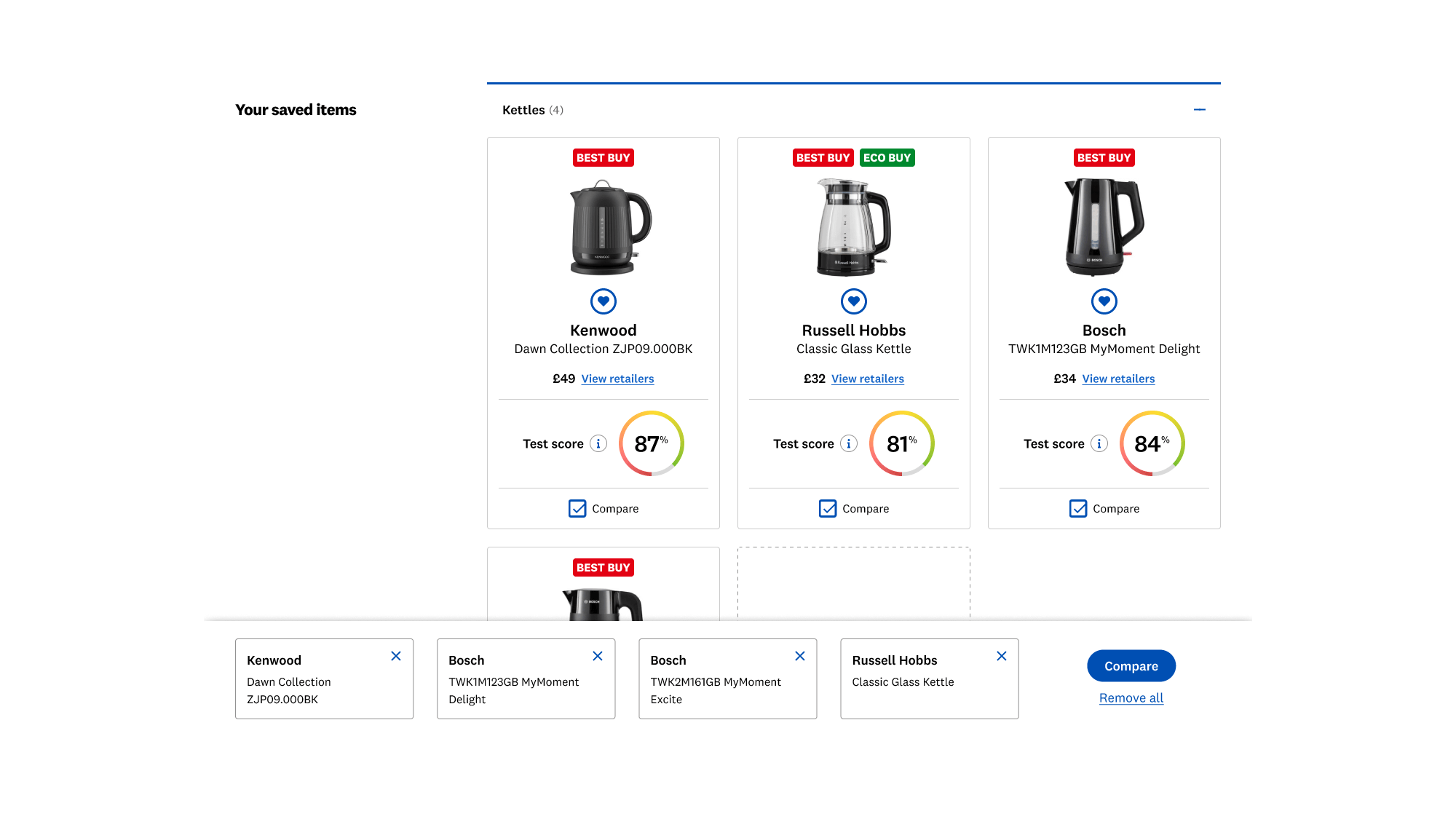
- Compare on the saved page for shortlisting products
Impact
As a result of everything we shipped, we saw YoY increases of 38% and 23% in compare engagement and affiliate clicks respectively. The YoY increase in engagement was a big surprise for us. It was incredibly rewarding after everything we did as a squad—contributing positively to both retention and revenue.
The compare journey and page was untouched for many years. I was part of the reviews rewrite project in 2022 where we updated the look of the page using design system components. How users interacted with the page stayed the same.
In 2024, the action of comparing products became a high-value action within the business because the research and data showed how important this stage of the research and buying journey was to users.
Reflections
The biggest challenge we had as a design and research team was pushing for this type of work that improves key journeys for our members. It took a long time to convince product and stakeholders that this would be worthwhile to focus on. It never became a priority until retention became a problem.
We managed to tell a story of how essential it is to understand the research and buying journey, further validate our ideas, and release things that benefit both our users and business goals.
The end
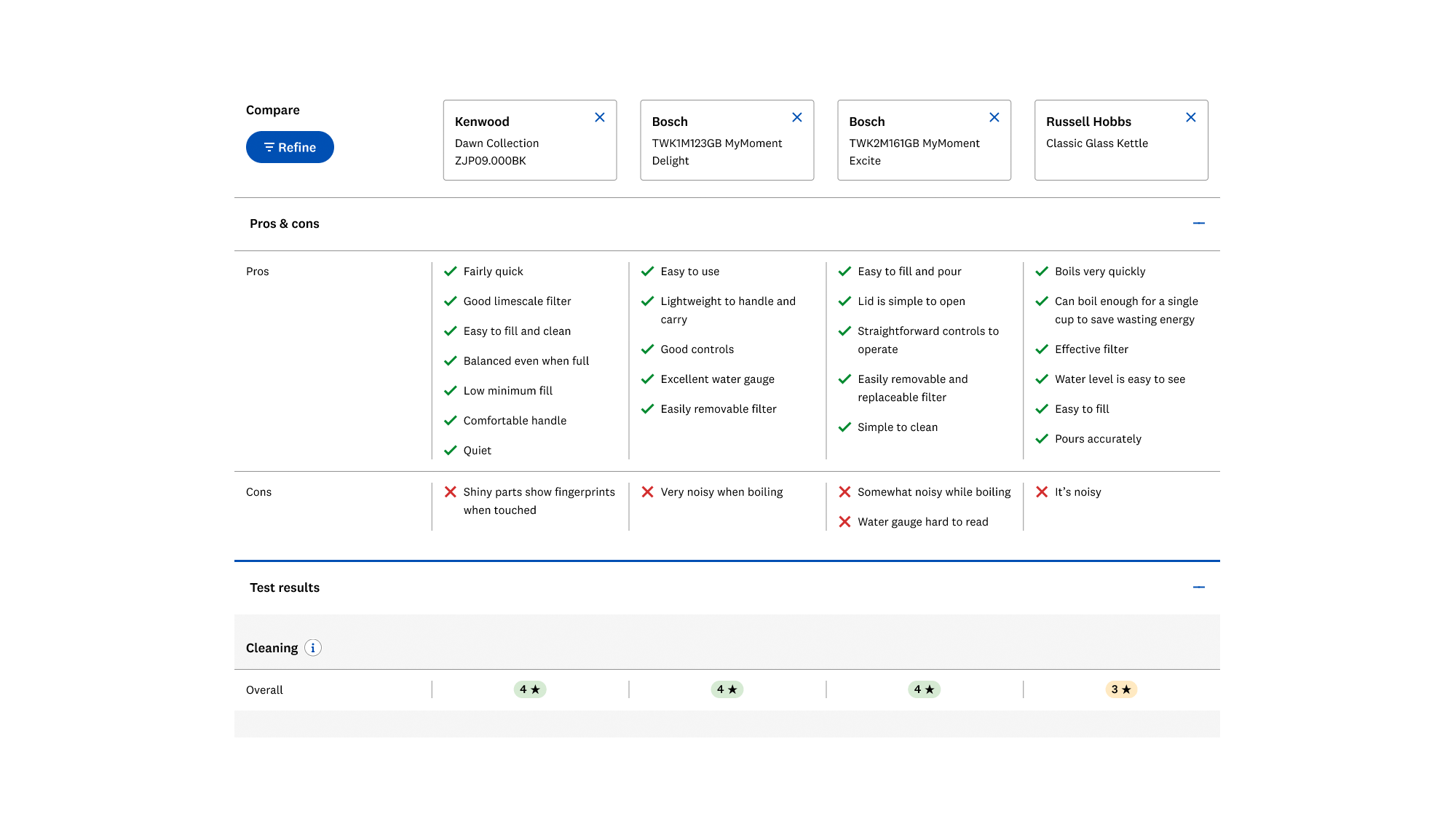
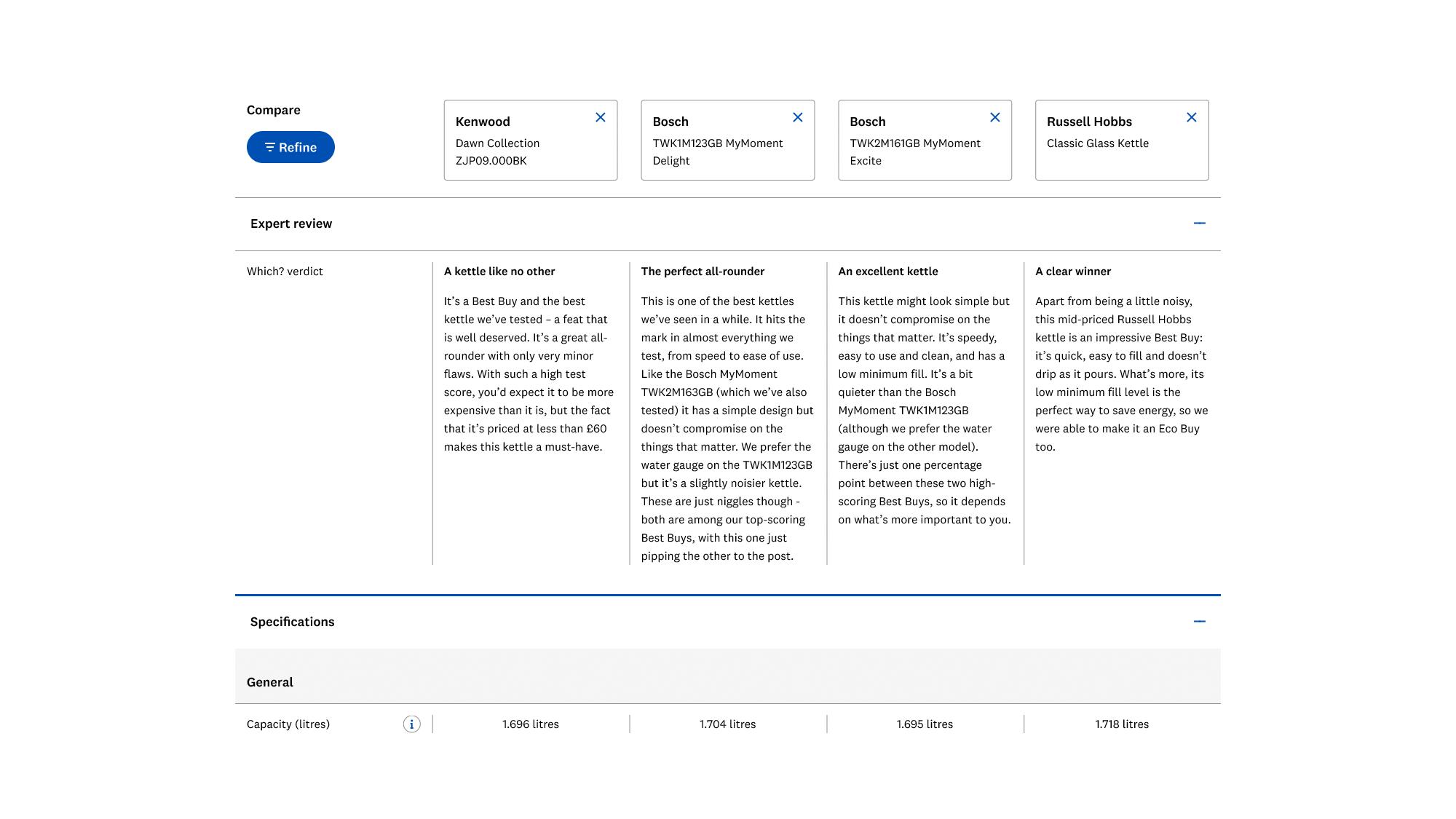
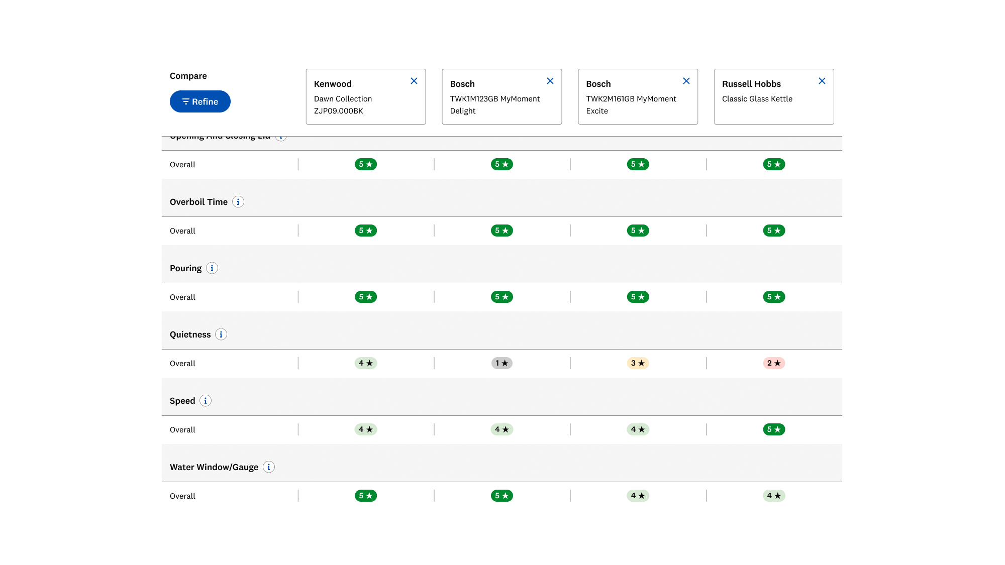
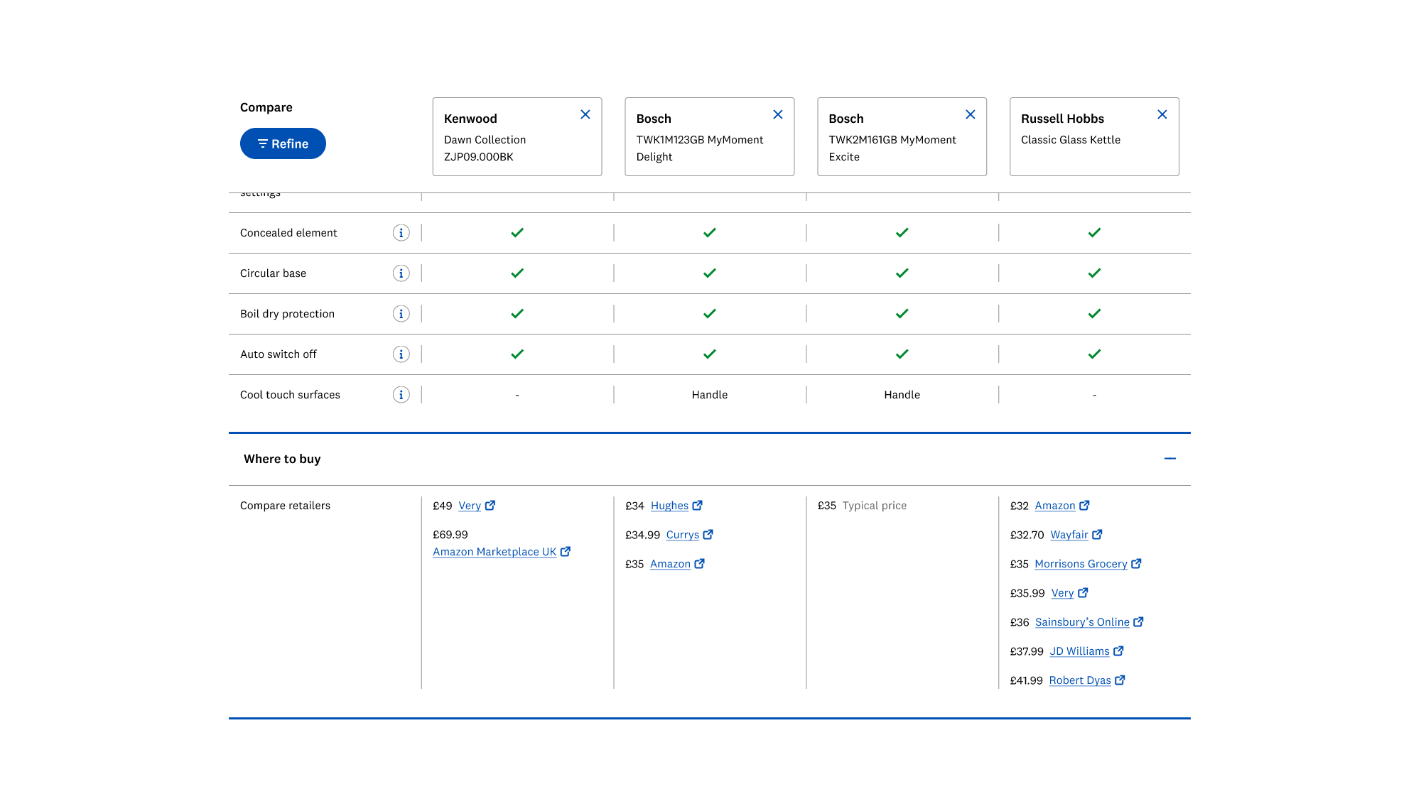
As a thank you for scrolling this deep, here's everything we improved on the compare page using evaluative insights.
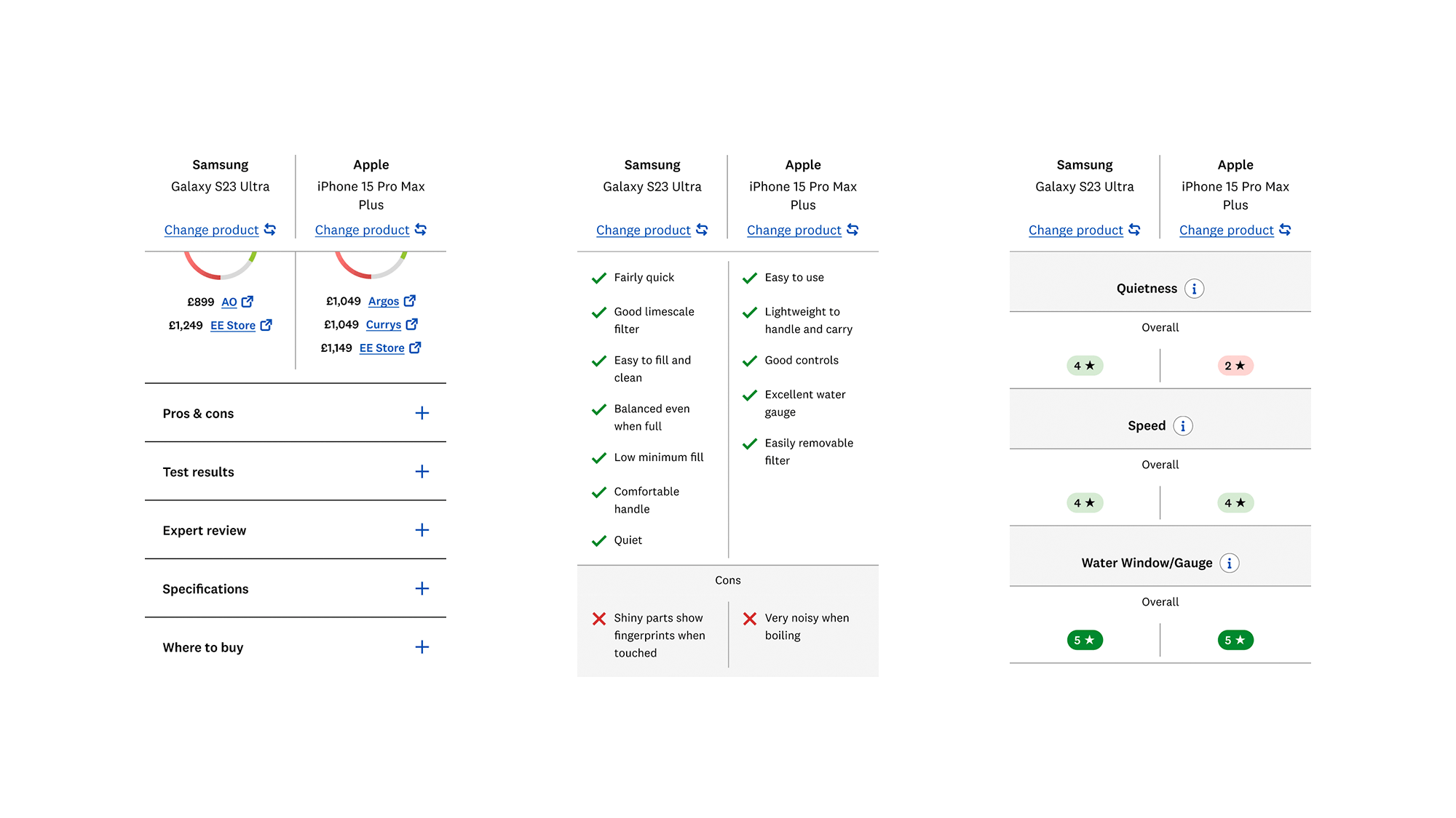
- Compare page enhancements
- New pros & cons section
- Added in accordions (collapsed by default on mobile)
- New expert review section with W?'s verdict
- Revamped star rating design
- Improved spacing between sections
- New section displaying all available retailers and prices